By Nicole Webster
Some of you more social-networky types may have notices a few changes. This is the first step in a huge rebranding project! The information and quotes below were given to me by Heather Alexander, who is the project manager. The opinions stated below are my own.
Purpose
“The BMSC brand is broader than its visual identity, more than a signature or symbol. Our brand is the intangible sum of the our attributes: its name, values, offerings, people, its history and reputation and the way it is experienced and promoted. “
I think the idea is to show off to others what the BMSC is, and give it a facelift at the same time.
Why?
- Well a big reason is the loss of NSERC funding, which has been a big blow to the station. The idea is to create a fresh image, promoting the station to its member universities, as well as to possible funding sources, and hopefully keeping things running.
- A big part of this campaign will be to change the way our five member universities (UVic, SFU, UBC, UofA, UofC) look at the BMSC. “[T]o raise the profile of BMSC and show that BMSC is a valued asset, and to give a sense of ownership to the home universities.” Before I arrived, I though if BMSC a ‘field station’, an offshoot of the biology department for research or some undergrad courses. This is becoming less true, and the BMSC wants to remind/inform the universities of that, “to engage the member universities in the idea that BMSC is a branch of their campus, with facilities useful to many departments.” BMSC has started making inroad into other areas of research, offering popular non-biology courses in archaeology, ethonobotany, science for non science majors, and science film making and journalism. The same sort of outreach has been going on at the research level, with social scientists staying on station and engineers coming to use the gigantic flume for fluid dynamics studies
- A second reason is discontinuity. The Bamfield Marine Sciences Centre used to be the Bamfield Marine Station, and not everything was changed to reflect the new name (eg. www.bms.bc.ca, rather than the new www.bamfieldmsc.com [Both links still work]). The starfish logo is no always the same colour or shape, and is thus not standardized.
- A third reason is opportunity: “Mark Doherty, owner of Massif, a PR/Design firm from Vancouver, and a part time resident of Bamfield, has offered the services of his company at a greatly reduced rate.”
What?
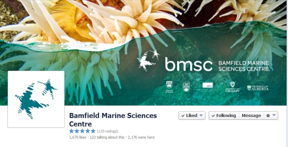
We have already seen some changes on the internet. There have been updates to twitter, facebook, youtube, google+, and linkedin, and the main webpage.
They have also created a single BMSC alumni facebook group, as a single place to make updates available to past students, and a place where all of us can interact, rather than in our separate cohorts (eg. summer 2012, fall 2013…).
The merchandise is being updated, with the first order already arrived, reflecting the new logo and colour scheme.

Mock up of the new merchandise. Don’t fret, they have hoodies too! (and T-shirts, sweat pants, toques, travel mugs…)
Changes are ongoing, and most are superficial to date, creating a uniform scheme to the BMSC web presence, as well as in brochures, buisiness cards, headers, signage at the station… However, I’m quite excited for the major update to the webpage that is forthcoming, updating information, and (hopefully) making the site more usable.
Thoughts
As always, change is scary. I like the idea of bringing things into line, and especially the idea of better advertising to the member universities. Not only to increase enrollment but to hopefully increase funding and appreciation by the administrations.
There’s two new taglines (anyone know what the old one was, if it exists?):
‘Immerse yourself’
‘Your oceanside campus’
The first is clever and cute, the second seems more practical, and aimed directly at the universities, rather than students/clients.
I really don’t like the new logo. I see that it is stylish, and fresh, and its still got a starfish, but its all soft edges and texture. I understand that a new logo is expected with a revamp, but I love the simplicity of the coil-y starfish. If I were in charge (but I’m not, and I have no idea of the behind-doors situation), I would have made the font and colour changes, but left the starfish – a continuity to the past, a commitment to not too much change from what we love, nor a focus on appearance over substance.

One version of old logo.

New logo.
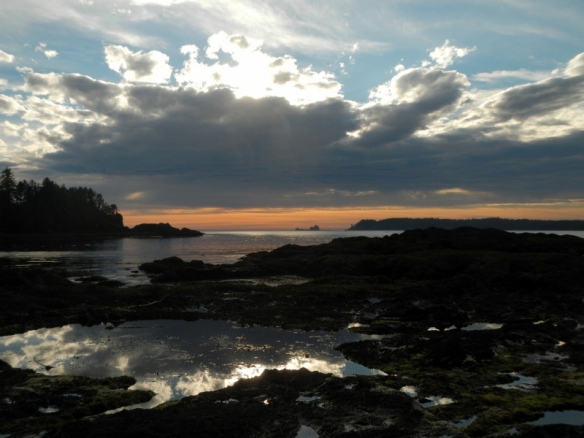
I do like the picture heavy content. The beauty of BMSC and Barkley sound are a major part of its success. I would note that both of these images are biologically impossible with water going only halfway up, but I like the style.
I’m also very excited to arrive in Bamfield, and see what practical changes (if any) will be made to the station itself and how it is run. I hope this will make the difference.
I would love to hear your thoughts on this.

Footer of website and letterhead.
.