Modelling: Conway’s Game of Life Implemented in R

Figure 1. Several iterations of the algorithm, beginning from a randomly determined initial position.

Figure 1. Several iterations of the algorithm, beginning from a randomly determined initial position.

By Allan Roberts

The R script provided below implements J.H. Conway’s “Game of Life” algorithm on an 8 by 8 grid. In this model, cells persist and propagate according to how many neighbours they have (including perpendicular and diagonal neighbours). A cell persists if it has either  2 or 3 neighbours, and empty cells become occupied if they have exactly 3 neighbours. This set of rules might be thought of as mimicking a single species population with density-related effects. Note that, in the final stable distribution shown in Figure 1, each green square is adjacent to either 2 or 3 other green squares.

Reference

Game of Life. Wolfram Mathworld:  http://mathworld.wolfram.com/GameofLife.html

R Script

#An implementation of J.H. Conway’s ‘Game of Life’ algorithm.
#Implemented by A. Roberts, May 2013

Life.Example = function(){
neighbours = function(M){
if (!is.matrix(M)) return(NULL);
m = dim(M)[1];
n = dim(M)[2];
left = cbind( rep(0,m), M[ ,1:(n-1)]);
right = cbind(M[ ,2:n], rep(0,m));
up = rbind( rep(0,n), M[1:(m-1),]);
down = rbind( M[2:m,], rep(0,n));
upper.right = M[1:(m-1),2:n];
upper.right = rbind(rep(0,n-1),upper.right);
upper.right = cbind(upper.right,rep(0,m));
lower.right = M[2:m,2:n];
lower.right = rbind(lower.right, rep(0,n-1));
lower.right = cbind(lower.right, rep(0,m));
lower.left = M[2:m,1:(n-1)];
lower.left = cbind(rep(0,n-1),lower.left);
lower.left = rbind(lower.left, rep(0,m));
upper.left = M[1:(m-1),1:(n-1)];
upper.left = rbind(rep(0,n-1),upper.left);
upper.left = cbind(rep(0,m),upper.left);

N =up+down+right+left+upper.right+lower.right+lower.left+upper.left;return(N);
}

N2 = function(M){
m = dim(M)[1];
n = dim(M)[2];
N2 = (neighbours(M)==2);
N2 = as.numeric(N2);
dim(N2) = c(m,n);
return(N2);
}

N3 = function(M){
m = dim(M)[1];
n = dim(M)[2];
N3 = (neighbours(M)==3);
N3 = as.numeric(N3);
dim(N3) = c(m,n);
return(N3);
}

update = function(M){
return( N3(M) + N2(M)*M);
}

random.setup = function(n){
M = matrix(sample(c(0,1),n*n,replace=TRUE),n,n);
return(M);
}

M = random.setup(8);
plot.new();
par( mfrow=c(4,4),mar=c(1,1,2,2));
for (i in 1:16){
M=update(M);
image(M,col=c(rgb(1,1,1),rgb(0,0.5,0)),axes=FALSE,frame=TRUE);mtext(side=3,paste(quote(iteration),i-1));
}
}
Life.Example();

Logistic Growth Model with R

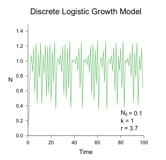
Figure 1. Example.

Figure 1. This graph was produced by the R script provided below.

Models like the discrete logistic growth model are famous for producing complex behaviour from simple equations. You can cut and paste the R script provided below onto the R command line, to produce a graph like the one given Figure 1. Try varying the parameter r to see what happens; for example, to set the parameter r to 1.5, enter the following:

> LogisticGrowthExample( r = 1.5 );

References

Logistic Equation. Wolfram Mathworld: mathworld.wolfram.com/LogisticEquation.html
Logistic Map. Wikipedia: en.wikipedia.org/wiki/Logistic_map

R Script

#NOTE: You will need to replace the right and left quotation marks with
#straight quotes before running this script in R.

LogisticGrowthExample <- function(r = 3.7, N0 = 0.1, steps = 100){
#Implemention by Allan Roberts, March 2013.

N <- numeric(steps);
N[1] <- N0; #the initial population

Next <- function(N) {N <-  N + (r-1)*N*(1-N)};
for (i in 2:(steps)) N[i] <- Next(N[i-1]);

plot(N~seq(0,(steps-1)),type=”l”,xlab=quote(time), ylim=c(0,1.5), las = 1 );
title(main=”Discrete Logistic Growth Model”, font.main=1, cex.main=2);
text(80,0.2,paste(“r =”,as.character(r) ), adj=c(0,0.5));
text(80,0.1, expression(“N”[0]), adj=c(0,0.5 ) );
text(84.14,0.1, paste(” =”,as.character(N[1])), adj=c(0,0.5) );
}

LogisticGrowthExample( );

Fractals with R, Part 2: the Sierpiński Carpet

by Allan Roberts

This post is a variation on the previous post, Fractals with R. Here it is shown how a different fractal pattern can be produced by just a slight variation in the R script; the result is an iteration of a fractal called the Sierpiński Carpet. The method used here is basically the same as that described in Weisstein (2012). Below is the R script that produces the image.

Figure 1. An iteration in the construction of the Sierpiński Carpet, which I produced using R.

This fractal is an example of a pattern with both large and small patches. There are also distributions in ecology which are patchy across scales; see, for example Levin (1992). You might find the Sierpiński Carpet somewhat reminiscent of a fragmented eelgrass bed, or a distribution of mussels and barnacles in the intertidal.

From the point of view of handling data structures, this Sierpiński Carpet plot is an exercise in using the “rbind” and “cbind” functions in R, which allow you to aggregate matrices and data frames. I’ve found these functions useful for working with oceanographic data, such as that plotted in my posts on how to plot NEPTUNE Canada data and VENUS network data. For more, see Fractals with R, Part 3.

R Script

IterateCarpet <- function(A){
B <- cbind(A,A,A);
C <- cbind(A,0*A,A);
D <- rbind(B,C,B);
return(D);
}

S <- matrix(1,1,1);
for (i in 1:5) S <- IterateCarpet(S);

image(S,col=c(0, 12), axes=FALSE);

References

Levin, Simon A., 1992. The Problem of Pattern and Scale in Ecology:  The Robert H. MacArthur Award Lecture. Ecology, 73 (6), 1992, pp. 1943-1967.

 R Development Core Team, 2011. R: A language and environment for statistical computing. R Foundation for Statistical Computing, Vienna, Austria.

Weisstein, Eric W. “Sierpiński Carpet.” From MathWorld– A Wolfram Wed Resource Accessed Oct. 22, 2012: http://mathworld.wolfram.com/SierpinskiCarpet.html

Oceanographic Data with R: Plot VENUS Network Data

By Allan Roberts

This tutorial provides instructions on downloading raw data from the Victoria Experimental Network Under the Sea (VENUS 2012) and plotting that data with the statistical application R (R Core Team 2012). For this tutorial, I will assume that you have at least some experience with R; however, if you have R installed, and can enter an instruction or two on the command line, that should be enough. If you want to plot data from the NEPTUNE Canada network, refer to my previous post, “How to plot NEPTUNE Canada data with R.” In general, downloading VENUS data is similar to downloading NEPTUNE data, but I did find that there are some differences.

Step 1. Download a data file 

1.1 Go to the VENUS network website:                                     www.venus.uvic.ca

Venus logo

1.2 If you already have an account click on “LOGIN.” (Note: If you have a NEPTUNE Canada account you can use the same e-mail and password to log into the VENUS site.) If you don’t have an account, click on “Register”:

Login

1.3 Click on “DATA” and choose “DOWNLOAD DATA”:

Download VENUS data

1.4 Under “Search Type” choose “Stationary Platform”:

Stationary platform

1.5 Under “Stationary Platform Data” choose “Search by Instrument”:

Search by instrument

1.6 There are gaps in the data record; for this example, I’ve chosen the last two weeks of August, 2012, as an example of a particular interval with available data. Under “Time Range” set the starting and ending date and time, and then click on “Search Active Locations”:

Search active locations

1.7 Under “Location” choose “Saanich Inlet”, “Central Node”, and “VIP-17.” I found these to be the default settings.

Location

1.8 Under “Instrument” choose “Aanderaa Optode 4175 (S/N 1684).” (Again, I found this to be the default setting.)

Anderaa optode

1.9 Under “Sensor(s)” choose “Temperature”:

Select temperature

1.10 Under “Processing” choose “No Averaging”:

No averaging

1.11 Under “Data Format” choose “Comma Separated Value Text File”:

csv file format

1.12 Leave “Metadata” (i.e. documentation) at the default setting of “FGDC HTML”, and click on “Search now”:

Search now

1.13 Wait ….

Requesting data

1.14 Click on the text file….

Data file

… you should get something like this:

Data file output

1.15 Here is one place where I found that downloading VENUS data differed a bit from downloading NEPTUNE data. For the VENUS data, I’ve found that the following works: Copy and paste the downloaded data into a Word file, and then save that file as a plain text file. The plain text file is readable from R. To copy the VENUS data, click on “Select All” …

Select all

… then click on “Copy”:

Copy from Safari

1.16 Paste the file into a Word document. Click on “Save As”; make the document name “VENUS data example”; make the location your desktop, and make the format “Plain Text”:

Save as plain text

When you save as a text file you may get the following warning. (The idea of saving as a text file is that we are not interested in fancy formatting, pictures, etc., we are only interested in the data.) Click “OK”.

File conversion

The result should be a “.txt” file called “VENUS data example” on your desktop:

File icon on desktop

1.17 Create a new folder, called “VENUS network data”, and drop the text file “VENUS data example” into this folder.

VENUS network data

Now that you have the VENUS data saved as a “.txt” file in your “VENUS network data” folder, you are ready to move onto the next step: reading the data file into R.

Step 2. Read the data file into R 

The steps for changing the working directory are the same as in the NEPTUNE data tutorial:

2.1 In the R console type “getwd( )”. This will tell you what your current working directory is:

getwd

2.2 If you are on a Mac click on “Misc”, and choose “Change Working Directory”:

set working directory mac

If you are on a PC, click on “File”, and choose “Change dir …”:

set working directory pc

2.3 If you are on a Mac, browse for the “VENUS network data” folder, click on it, and click on “Open”; if you are on a PC browse for the “NEPTUNE data” folder, click on it, and click on “OK.”

2.4 In the R console, type “getwd( )”; the “VENUS network data” folder should now be your working directory:

wd again with correct wd

2.5 Open the text file, and look at it. We want to skip all the documentation lines before the first line of data. For this example, there should be 15 lines. This includes the line with the variable names. (The variable names are not yet formatted for R; variable names in R need to be without spaces.)

read file skip 15 lines header false

2.6 Check the downloaded data by entering “head(data)”; this will show the first few lines of the data frame. (To see all the data, just type ”data”, and press enter.)

show data

2.7 To give names to the columns, type:

give names to columns

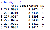
Enter “head(data)” again, and you should see names at the tops of the columns. (For this tutorial, we are not concerning ourselves with the flag variable in the third column.)
data with labels

Now that the data have been downloaded, you are ready to move onto plotting …


Step 3. Plot the data 

3.1 For a rough plot of the data, type:

rough plot code

rough plot

3.2 To plot the data as a line graph with a title, and with better axis labels, we can use two steps. First: The following command will plot the data without axis labels, and make the graph a line graph in blue.

line graph code

Second: Leave the graphics window open, and enter a command to add the title and axis labels.

Add title line

You should get a graph like the one below. I’ve found that the easiest way to put a graph made in R into a written document or slide show is to click on the graphics window and then use copy and paste.

final graph

3.3 Now go explore the other data available from the VENUS network!

Citations

VENUS, 2012. Website. Last accessed Oct. 17, 2012: www.venus.uvic.ca

R Core Team (2012). R: A language and environment for statistical computing. R Foundation for Statistical Computing, Vienna, Austria.

Fractals with R

by Allan Roberts

Many biological objects have structure that, at least at a glance, may appear rather fractal-like. A brief discussion of the applicability of fractals and fractal dimension to biology can be found in Vogel’s ‘Comparative Biomechanics‘ (2003, pp. 84–86). While noting that there seem to be few truly fractal objects in biology, Vogel speculates, “I think, […], that sponges may be fractal, with large ones organized mainly as foldings and refoldings of proliferated small ones, thereby making transitions between the organizational grades we learned as ascons, sycons, and leucons” (p. 86).

Sierpinski triangles

Figure 1. Four iterations in the construction of a Sierpinski triangle-like object. I produced these graphics using the statistical programming language R (R Development Core Team, 2011).

I’ve included an image, representing the construction of a fractal largely similar to a famous fractal, the Sierpiński triangle. A mathematical description of the Sierpiński triangle can be found in Vejnar (2012). (In contrast to the actual Sierpiński triangle, my example is based on right-angled triangles, rather than on equilateral ones.) These images were produced using the statistics application and programming language R (R Development Core Team, 2011). I’ve also included the R script that I used to produce the graphics. For more, see Fractals with R, Part 2.

R Script
IterateTriangle <- function(A){
    B <- cbind(A,0*A);
    C <- cbind(A,A);
    D <- rbind(B,C);
return(D);
}

par(mfrow=c(2,2))
for (i in 1:4){
    T <- matrix(1,1,1)
    for (i in 1:i) T <- IterateTriangle(T);
    image(T,col=c("white","black"),axes=FALSE);
    text(0,1,i,col="black") 
}

References

R Development Core Team, 2011. R: A language and environment for statistical computing. R Foundation for Statistical Computing, Vienna, Austria.

Vejnar, Benjamin. 2012. A topological characterization of the Sierpiński triangle.       Topology and its Applications, 159 (5), 1404-1408.

Vogel, Steven. 2003. Comparative Biomechanics: Life’s Physical World. Princeton University Press: Princeton, New Jersey.

Book review – ‘More’ (a mathematical biology perspective)

by Allan Roberts

Book Discussed: Springman, I.C. (writer), Lies, Brain (illustrator). More. Houghton Mifflin Harcourt Publishing Company: New York, New York.

If you’re a student of biology you might have noticed a general lack biological accuracy in how animals are represented in children’s cartoons and literature. One thing that impressed me about the children’s book ‘More’ was the general phenotypic correctness of the main character, a bird. Or to be specific, a black-billed magpie (Pica hudsonia).

The storyline is structured around the magpie amassing an ever-greater collection of haphazard objects. The things that the bird collects include an intriguing assortment of cultural artifacts: tokens from board games (Scrabble, Monopoly, chess), a shopping list, pencils (HB and 2H), a pocket knife, a comb, a cassette tape labeled “THE WALL.” Objects perhaps reminiscent of a typical cluttered kitchen drawer of odds and ends.

Also interesting, from the ornithological perspective is that the bird has an identification number printed on a leg band.

What’s the identification number of the bird in the book ‘More’ ?

Because individual pictures offer only partial glimpses of the identification number, it is difficult to reconstruct the number with absolute certainty. However, the number begins with 31415 : the first few digits of pi.

Yup. It’s a mag-π.

Magpie

Credit: David Herr. Photo Source: USDA Forest Service “Find-a-Photo” site: https://fsplaces.fs.fed.us/fsfiles/unit/wo/wfrp/find_a_photo.nsf/