Jack O’ Lanterns Made with R

Figure 1.

Figure 1. Jack O’ Lanterns carved with the statistics application R, by students in the Bamfield Marine Sciences Centre Fall Program.

Maybe you already know that the computer programming language R can be used for statistics, and data visualization. You can also use it to draw pictures. The easiest way to do this is by using the ‘locator’ and ‘polygon’ functions. You can make your own Jack O’ Lantern with R using the script provided in the previous post “Pumpkin Carving with R”.

Fractals with R, Part 5: Sierpinski Carpet with ggplot2

Figure 1. Sierpinski Carpet

Figure 1. Sierpinski Carpet.

By Allan Roberts

This post uses the graphics package ggplot2 (Wickham, 2009) to illustrate a new method of making an image of the Sierpiński Carpet, which was featured in a previous post (Fractals with R, Part 2: the Sierpiński Carpet). The method used to make the matrix representing the fractal is the same; again, the algorithm is essential the same as the described in described in Weisstein (2012), but implemented in R. In this post, I have used the graphics package ggplot2 to display the image. The ggplot2 layer “geom_tile” produces output much like the function “image” in the base graphics package. View ports made with the “grid” package are used to make the four panels of the plot shown in figure 1; one of the advantages of ggplot2 is that it makes it relatively easy to work with the grid package in this way. Because the function “ggplot” takes a data frame as an argument,  some extra work was required to turn the matrix representing an iteration of the fractal into a data frame with X and Y columns for the positions of cells, and an indicator column I to represent the colour of the cell. Running the script provided below requires that you have the “ggplot2” package installed; if you have an internet connection, this can be done by entering install.packages(“ggplot2”) on the R command line. (The grid library should come already installed with the basic installation of R.)

Reference

H. Wickham. ggplot2: elegant graphics for data analysis. Springer New York, 2009.

Weisstein, Eric W. “Sierpiński Carpet.” From MathWorld– A Wolfram Wed Resource Accessed Oct. 22, 2012: http://mathworld.wolfram.com/SierpinskiCarpet.html

R Script

#Written by Allan Roberts, Feb 2014
library(ggplot2)
library(grid)
SierpinskiCarpet <- function(k){
Iterate <- function(M){
A <- cbind(M,M,M);
B <- cbind(M,0*M,M);
return(rbind(A,B,A))
}
M <- as.matrix(1)
for (i in 1:k) M <- Iterate(M);
n <- dim(M)[1]
X <- numeric(n)
Y <- numeric(n)
I <- numeric(n)
for (i in 1:n) for (j in 1:n){
X[i + (j-1)*n] <- i;
Y[i + (j-1)*n] <- j;
I[i + (j-1)*n] <- M[i,j];
}
DATA <- data.frame(X,Y,I)
p <- ggplot(DATA,aes(x=X,y=Y,fill=I))
p <- p + geom_tile() + theme_bw() + scale_fill_gradient(high=rgb(0,0,0),low=rgb(1,1,1))
p <-p+ theme(legend.position=0) + theme(panel.grid = element_blank())
p <- p+ theme(axis.text = element_blank()) + theme(axis.ticks = element_blank())
p <- p+ theme(axis.title = element_blank()) + theme(panel.border = element_blank());
return(p)
}
A <- viewport(0.25,0.75,0.45,0.45)
B <- viewport(0.75,0.75,0.45,0.45)
C <- viewport(0.25,0.25,0.45,0.45)
D <- viewport(0.75,0.25,0.45,0.45)
quartz(height=6,width=6)
print(SierpinskiCarpet(1),vp=A)
print(SierpinskiCarpet(2),vp=B)
print(SierpinskiCarpet(3),vp=C)
print(SierpinskiCarpet(4),vp=D)

Fractals with R, Part 4: The Koch Snowflake

Figure 1. The Koch Snowflake

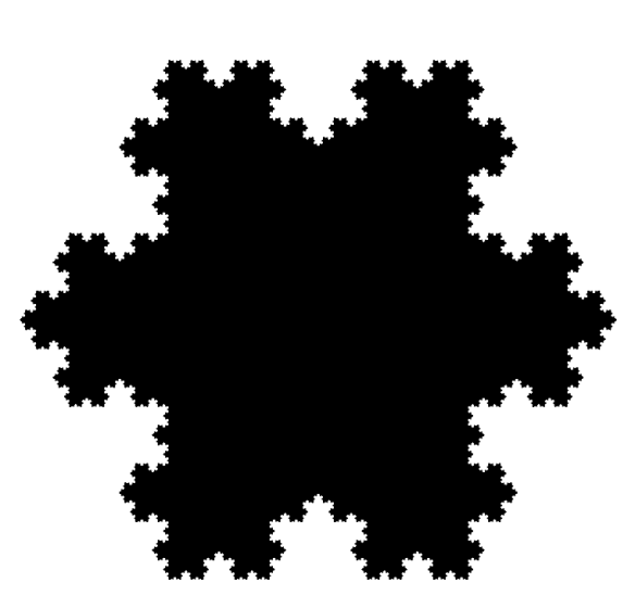
Figure 1. An approximation of the Koch Snowflake.

By Allan Roberts

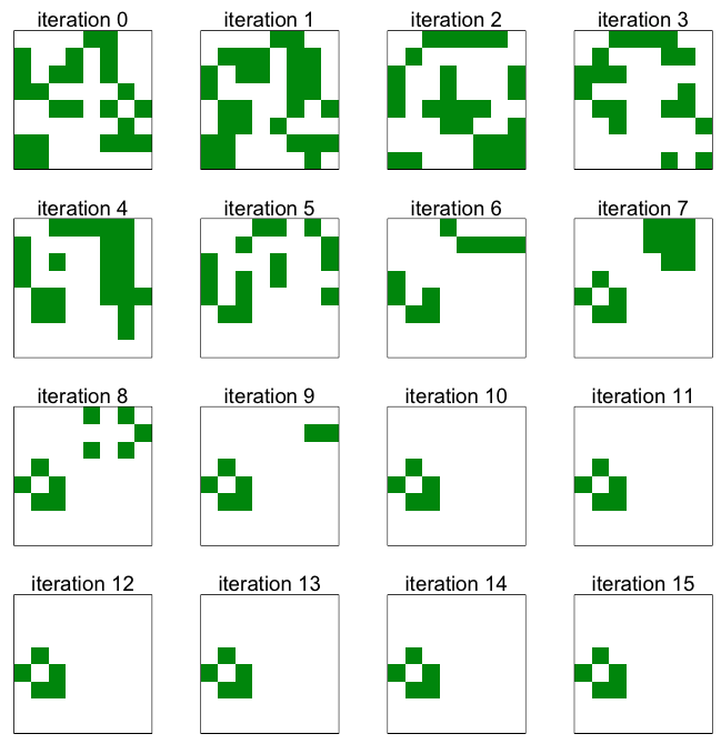
An interesting property of the Koch Snowflake is that it has a boundary, or edge, of infinite length. (For another curve of infinite length, confined within a finite area, see the post on the Hilbert Curve.) The shape is constructed out of equilateral triangles. A picture showing an approximation of the Koch Snowflake is given in Figure 1; this is only an approximation, since the shape would be defined as the limit of the process suggested in Figure 2. For more detail on the mathematics of the construction, you might like to start with the references given below (Wikipedia 2013; Wolfram MathWorld 2013).

Figure 2. Iterations of the snowflake.

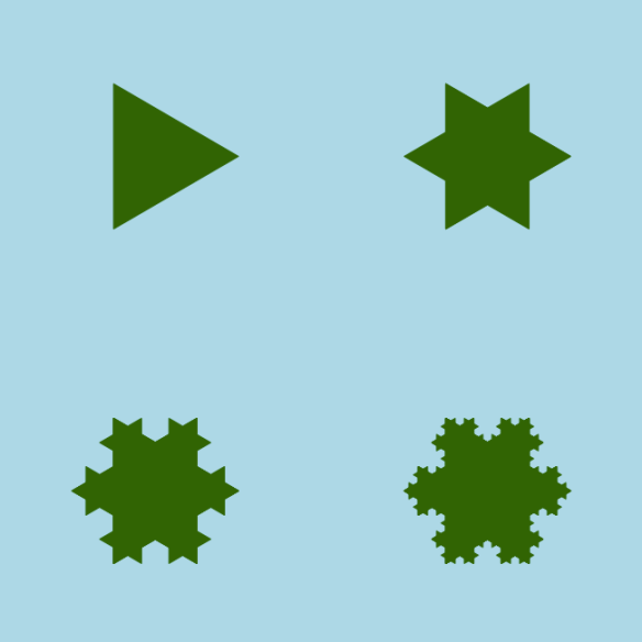
Figure 2. Iterations of the snowflake (or island, depending on the colour scheme).

From the ecological point of view, you might find this fractal thought-provoking when it comes to questions of scale. Suppose, for example, that you think a certain boundary, such as a shoreline, is ecologically important, and you want to measure it. Then the length will depend on the scale of measurement. (See, for example, Mandelbrot, 1967.)

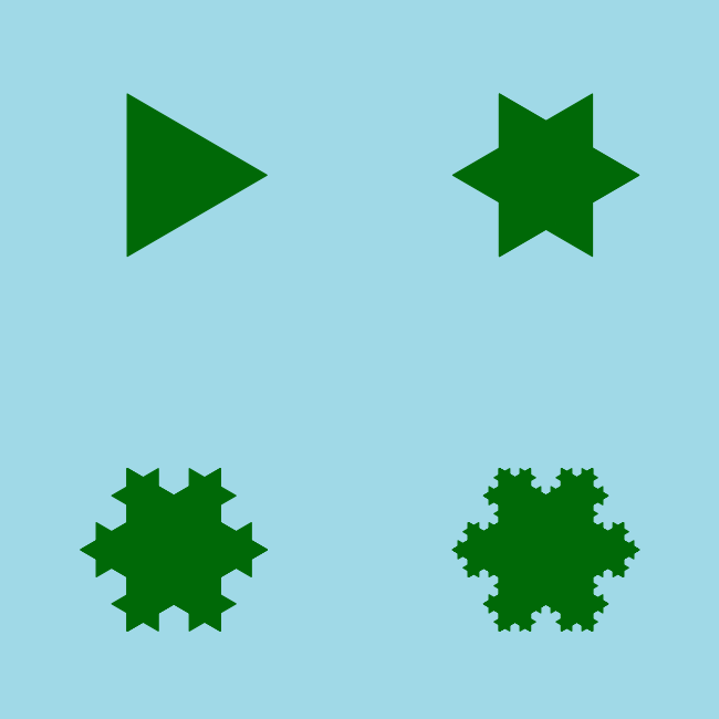
Figures 1 and 2 were produced using the functions provided in the R Script below. I’ve focused on drawing the images, rather than constructing the set of points that describe the fractal edge of the shape. My algorithm is inefficient in the sense that it computes many more triangles than required; also, the large number of conditional statements suggests that the number of lines of code could be reduced. The key concept is contained within a function that takes the vertices of a triangle as input, and which returns the vertices of a smaller triangle as output; this function is then called  recursively. To find the vertices of smaller triangles,  the new vertices are computed as linear combinations of the old vertices.

References

Koch Snowflake. Wikipedia: http://en.wikipedia.org/wiki/Koch_snowflake
Koch Snowflake. Wolfram Mathworld: http://mathworld.wolfram.com/KochSnowflake.html
Mandlebrot, B. 1967. How long is the coast of Britain? Science, 156 (3775), pp. 636-638.

R Script
#Script by A. Roberts, 2013.
#To run the script, copy and paste it onto the R command line, and press ,<enter>.

KochSnowflakeExample <- function(){
iterate <- function(T,i){
A = T[ ,1]; B=T[ ,2]; C = T[,3];
if (i == 1){
d = (A + B)/2; h = (C-d); d = d-(1/3)*h;
e = (2/3)*B + (1/3)*A; f = (1/3)*B + (2/3)*A;
}

if (i == 2){
d = B; e = (2/3)*B + (1/3)*C; f = (2/3)*B + (1/3)*A;
}

if (i == 3){
d = (B + C)/2; h = (A-d); d = d-(1/3)*h;
e = (2/3)*C + (1/3)*B; f = (1/3)*C + (2/3)*B;
}

if (i == 4){
d = C; e = (2/3)*C + (1/3)*A; f = (2/3)*C + (1/3)*B;
}

if (i == 5){
d = (A + C)/2; h = (B-d); d = d-(1/3)*h;
e = (2/3)*A + (1/3)*C; f = (1/3)*A + (2/3)*C;
}

if (i == 6){
d = A; e = (2/3)*A + (1/3)*C; f = (2/3)*A + (1/3)*B;
}

if (i == 0){
d = A; e = B; f = C;
}

Tnew = cbind(d,e,f)
return(Tnew); #Return a smaller triangle.
}

draw <- function(T, col=rgb(0,0,0),border=rgb(0,0,0)){
polygon(T[1,],T[2,],col=col,border=border)
}

Iterate = function(T,v,col=rgb(0,0,0),border=rgb(0,0,0)){
for (i in v) T = iterate(T,i);
draw(T,col=col,border=border);
}

#The vertices of the initial triangle:
A = matrix(c(1,0),2,1);
B = matrix(c(cos(2*pi/3), sin(2*pi/3)),2,1);
C = matrix(c(cos(2*pi/3),-sin(2*pi/3)),2,1);
T0 = cbind(A,B,C);

plot(numeric(0),xlim=c(-1.1,1.1),ylim=c(-1.1,1.1),axes=FALSE,frame=FALSE,ann=FALSE);
par(mar=c(0,0,0,0),bg=rgb(1,1,1));
par(usr=c(-1.1,1.1,-1.1,1.1));

#Draw snowflake:
for (i in 0:6) for (j in 0:6) for (k in 0:6) for (l in 0:6) Iterate(T0,c(i,j,k,l));
}
KochSnowflakeExample(); #Run the example.

Error Bars with R: Part 2

Figure 1. Example error bars.

Figure 1. Example error bars.

By Allan Roberts

This is a follow up to a previous post, Error Bars with R. The main difference is that the function used here allows the upper and lower limits of each error bar to be specified individually (rather than using a single parameter for the radius of an interval). Also, the “segments” function is used instead of the “arrows” function. The “segments” function is a lot like the “lines” function, except the endpoints of the line segments are given differently for the two functions. I’ve found that the segments function can be more useful if you wish to vectorize the drawing of multiple segments. (In the example below, the function “segments” is passed vectors of values; in general this is faster than using a for loop for the same purpose.)

Copying and pasting the script below should reproduce the example figure shown above. (Note: depending on whether you’re using a Mac or a PC, either the “quartz” or “windows” function should work to open a new graphics window, as indicated in the comments to the script.)

R Script

add.error.bars <- function(X,upper,lower,width,col=par( )$fg,lwd=1){
segments(X,lower,X,upper,col=col,lwd=lwd,lend=1);
segments(X-width/2,lower,X+width/2,lower,col=col,lwd=lwd,lend=1);
segments(X-width/2,upper,X+width/2,upper,col=col,lwd=lwd,lend=1);
}

X = 1:10; #A sequence of the integers from 1 to 10, inclusive.
Y =   c(1.7, 3.5, 5.4,3,6,5.5,4.9,4.5,1.8,2.7); #Example values for y.
upper=c( 2, 5, 6, 4, 8, 7, 6, 7, 4, 3); #Upper limits for the error bars.
lower=c(1.5, 2, 5, 2, 5, 4.5, 3.7, 2, 1, 2.5); #Lower limits.

quartz(character(1),5,5); #Open a new graphics window on a Mac.
windows(character(1),5,5); # On a PC
plot.new();
par(usr=c(0,11, 0,max(upper)+1)); #Set the limits for the plotting window axes.
axis(1); #Draw the horizontal axis.
axis(2,las=1); #Draw the vertical axis.
box(bty=letters[12], lwd=2); #Draw a frame around the plot.
title(main=quote(Example),cex.main=2,font.main=1); #Add a title.
points(X,Y); #Plot the data points.

add.error.bars(X,lower,upper,width=0.2,col=rgb(0,0,1)); #Draw the error bars.

Graphics with R: an introduction to ggplot2

Figure. An example plot, made with the R graphics package "ggplot2".

Figure. An example plot, made with the R graphics package “ggplot2”.

By Christina Suzanne

ggplot2 is a flexible graphing package that makes it easier to produce good plots without having to program every single detail. However, using ggplot2 requires a mental shift in the way you think about making plots, including getting familiar with the terminology:

  • Data – what we want to visualize; for ggplot() data must be in a data.frame in a long format
  • Geoms – geometric objects that represent data such as points, bars, lines
  • Aesthetics – visual properties of geoms, e.g. (x,y) position, symbol
  • Mappings – connect data values to aesthetic

Beginning to plot in ggpplot2 can be tricky at first; however, because of its growing popularity, there is a lot of support for it on R forums. Another useful resource is the R Graphics Cookbook (Chang 2013).

You can run the script provided below by cutting and pasting it onto the R command line and pressing <enter>.

 R Script

#Script written by Christina Suzanne, June 2013
#Note: after each change the the graph, entering “p” is required to view the new graph.
#In the following, the function “quote” can be replaced with quotes. E.g. quote(Weight)

#can be entered as “Weight”. R uses only straight quotes, rather than left and right quotes;
#Wordpress prefers to use left and right quotes. Hence the use of the “quote” function.

data(chickwts)   #Load chickwts data
chickwts         #Look at data
library(ggplot2) #Load ggplot2 library

#Make a Boxplot using chickwts data:
p <- ggplot(chickwts, aes(x=feed,y=weight)) + geom_boxplot( ) #defining a boxplot
p    #Viewing the plot. After each change the the graph, entering “p” is required to view the new graph.

#Make a legend filled with default colours:
p <- ggplot(chickwts, aes(x=feed, y=weight, fill = feed)) + geom_boxplot( );

#Capitalize the legend title to “Feed” (with a capital) and abbreviate the labels:
p <- p + scale_fill_discrete(name=quote(Feed), labels = c(quote(C), quote(HB), quote(LS), quote(MM), quote(SB), quote(SF)));

#Change the y axis title and set y axis limits; make breaks at every 100:
p <- p + scale_y_continuous(name=quote(Weight), limits = c(0, 700), breaks = 0:700*100);

#Make the y axis title black and size 17:
p = p + theme(axis.title.y = element_text(size=17, colour = rgb(0,0,0)))

#Make the x axis title black and size 17:
p = p + theme(axis.title.x = element_text(size=17, colour=rgb(0,0,0)));

#Change x axis labels to size 12 and colour to black:
p = p + theme(axis.text.x = element_text(size=12, colour=rgb(0,0,0)))

#Make the y axis labels black and change the size to 12:
p = p + theme(axis.text.y = element_text(size=12, colour = rgb(0,0,0)));

#Change legend colour to black and the size to 15:
p = p + theme(legend.title = element_text(colour=rgb(1,0,0), size=15 ));

#Change legend labels to black and size to 11:
p <- p + theme(legend.text = element_text(colour=rgb(0,0,0), size = 11))

#Add a box around the legend:
p <- p + theme(legend.background = element_rect( ))

#Modify legend box to be filled in “white”, with a size = “0.5”, and linetype = “dotted”:
p = p + theme(legend.background = element_rect(fill=rgb(1,1,1), size=0.5, linetype=2));

#Position legend on plot:
p <- p + theme(legend.position=c(0.27,0.8))

#Add a title:
p <-  p + ggtitle(quote(Chickens))

# Finally, modify title, reduce line spacing and make bold
p <- p + theme(plot.title = element_text(lineheight=0.8, face=quote(bold)))

p #view the final plot


References

Cookbook for R. Winston Chang. http://www.cookbook-r.com/Graphs/

ggplot2: An implementation of the grammar of graphics in R. Hadley Wickham. (H. Wickham. ggplot2: elegant graphics for data analysis. Springer New York, 2009.)

Ocean Alive: Trailer Release

Figure 1. Ocean Alive.

Ocean Alive is a television project by Ocean Networks Canada (ONC). ONC maintains cabled ocean observatory networks in the North-East Pacific and the Salish Sea, as well as an Arctic observatory located at Cambridge Bay, Nunavut. ONC is a University of Victoria initiative.

Ocean Alive is a television project by Ocean Networks Canada (ONC), with deep-sea
video from the ONC cabled observatory network, and featuring research by ocean scientists. Find out more on the Ocean Networks Canada website.

View the trailer and like us on the Ocean Alive Facebook page.

Figure 2. A Skate.

Photo credit: NEPTUNE Canada observatory, Ocean Networks Canada.

Modelling: Conway’s Game of Life Implemented in R

Figure 1. Several iterations of the algorithm, beginning from a randomly determined initial position.

Figure 1. Several iterations of the algorithm, beginning from a randomly determined initial position.

By Allan Roberts

The R script provided below implements J.H. Conway’s “Game of Life” algorithm on an 8 by 8 grid. In this model, cells persist and propagate according to how many neighbours they have (including perpendicular and diagonal neighbours). A cell persists if it has either  2 or 3 neighbours, and empty cells become occupied if they have exactly 3 neighbours. This set of rules might be thought of as mimicking a single species population with density-related effects. Note that, in the final stable distribution shown in Figure 1, each green square is adjacent to either 2 or 3 other green squares.

Reference

Game of Life. Wolfram Mathworld:  http://mathworld.wolfram.com/GameofLife.html

R Script

#An implementation of J.H. Conway’s ‘Game of Life’ algorithm.
#Implemented by A. Roberts, May 2013

Life.Example = function(){
neighbours = function(M){
if (!is.matrix(M)) return(NULL);
m = dim(M)[1];
n = dim(M)[2];
left = cbind( rep(0,m), M[ ,1:(n-1)]);
right = cbind(M[ ,2:n], rep(0,m));
up = rbind( rep(0,n), M[1:(m-1),]);
down = rbind( M[2:m,], rep(0,n));
upper.right = M[1:(m-1),2:n];
upper.right = rbind(rep(0,n-1),upper.right);
upper.right = cbind(upper.right,rep(0,m));
lower.right = M[2:m,2:n];
lower.right = rbind(lower.right, rep(0,n-1));
lower.right = cbind(lower.right, rep(0,m));
lower.left = M[2:m,1:(n-1)];
lower.left = cbind(rep(0,n-1),lower.left);
lower.left = rbind(lower.left, rep(0,m));
upper.left = M[1:(m-1),1:(n-1)];
upper.left = rbind(rep(0,n-1),upper.left);
upper.left = cbind(rep(0,m),upper.left);

N =up+down+right+left+upper.right+lower.right+lower.left+upper.left;return(N);
}

N2 = function(M){
m = dim(M)[1];
n = dim(M)[2];
N2 = (neighbours(M)==2);
N2 = as.numeric(N2);
dim(N2) = c(m,n);
return(N2);
}

N3 = function(M){
m = dim(M)[1];
n = dim(M)[2];
N3 = (neighbours(M)==3);
N3 = as.numeric(N3);
dim(N3) = c(m,n);
return(N3);
}

update = function(M){
return( N3(M) + N2(M)*M);
}

random.setup = function(n){
M = matrix(sample(c(0,1),n*n,replace=TRUE),n,n);
return(M);
}

M = random.setup(8);
plot.new();
par( mfrow=c(4,4),mar=c(1,1,2,2));
for (i in 1:16){
M=update(M);
image(M,col=c(rgb(1,1,1),rgb(0,0.5,0)),axes=FALSE,frame=TRUE);mtext(side=3,paste(quote(iteration),i-1));
}
}
Life.Example();

Drawing an Icosahedron with R

Figure 1. A blue icosahedron.

Figure 1. A blue icosahedron.

Allan Roberts

To construct an icosahedron, I began with the following premises: all edges have the same length, all faces are triangles, and five faces meet at every vertex. I then calculated the coordinates for twelve vertices equidistant from the origin. The script given below will produce an image like Figure 1. For brevity, I have simply given the vertex coordinates and shades of the faces rather than providing the underlying calculations. Do the x, y and z coordinates provided indeed describe an approximate icosahedron? If you want to, you can verify this by computing the distances between points.

R Script

#Blue planet icosahedron.
#Script written by Allan Roberts, April 2013.

X = c(1, 0.309, -0.809, -0.809,  0.309,  0.809, -0.309, -1.000, -0.309,  0.809,  0,  0);
Y = c(0,  0.951,  0.588, -0.588, -0.951,  0.588,  0.951,  0, -0.951, -0.588,  0,  0);
Z = c(0.5,  0.5,  0.5,  0.5,  0.5, -0.5, -0.5, -0.5, -0.5, -0.5,  1.118, -1.118);

Vertices = data.frame(X,Y,Z);

par(bg=gray(0));
plot.new();
par(usr=c(-3,3,-3,3));
shade = c(0.67, 0.89, 0.66, 0.30, 0.30, 0.30, 0.66, 0.30, 0, 0);

F1 = Vertices[c(1,2,12), ];
F2 = Vertices[c(2,3,12), ];
F3 = Vertices[c(3,4,12), ];
F4 = Vertices[c(4,5,12), ];
F5 = Vertices[c(5,1,12), ];
F6 = Vertices[c(1,2,6), ];
F7 = Vertices[c(2,3,7),];
F8 = Vertices[c(3,4,8),];
F9 = Vertices[c(4,5,9),];
F10 = Vertices[c(5,1,10),];

Faces = list(F1,F2,F3,F4,F5,F6,F7,F8,F9,F10);
for (i in 1:10) names(Faces[[i]]) = c(quote(X),quote(Y),quote(Z) );
for (i in 1:10) polygon(Faces[[i]]$X,Faces[[i]]$Y, col=rgb(0,0,0.2 + 0.8*shade[i]) );

R Bootcamp 2013 at BMSC

A beautiful Sunday in Bamfield (photo credit: Gillian Walker).

A beautiful Sunday in Bamfield (photo credit: Gillian Walker).

By Christina Suzanne

This year’s R bootcamp ran from March 3-7, 2013, immediately following the
Pacific Ecology and Evolution Conference (PEEC 2013). The workshop was
taught by Dr. Jean Richardson and Dr. Brad Anholt. The participants
ranged from R novice to R veterans; however, everyone learned something
useful and new! The five intensive days covered such things as data
input/output, managing data, scatterplots, error bars, maps,
multi-panel figures, t-tests, ANOVA, multivariate analysis, mixed effect
models, and much, much more! It also introduced various R packages, including ggplot2, vegan and lme4. Everyone left the workshop feeling much more
confident in R, and willing to tackle their own statistical problems using
R. Attending a future R bootcamp at BMSC is highly recommended to anyone who wants to start learning the R language, or increase their understanding of it!

Inside the black box, part 1: the one sample t-test

Figure 1. A figure produced using grid library view ports.

Figure 1. A figure produced using grid library view ports.

In a typical introductory statistics course, you’re given some assumptions, and provided with formulas for churning out p-values and confidence intervals. But statistics might be left feeling rather like a black box: we’re turning input into output, but it might seem difficult  to keep track of how all those assumptions and formulas work (or don’t).

One of the simplest stats tests that you’ll see in a first statistics course is the one sample t-test for testing the null hypothesis that the population mean for a random variable with a normal distribution is equal to zero. To implement this test in R all you need is the t.test( ) function. But what are the inner workings? The R script given below generates a pseudorandom sample and then puts it through the standard R function for a t.test, as well as a user defined version that should give you just about the same p-value. But wait… inside the t-test “box” other mysteries are to be found. For example: Where did the t-distribution come from in the first place? How should you interpret that p-value? And what’s up with that null hypothesis anyways? Sometimes asking questions leads to more questions… .

You can run the script provided below by cutting and pasting it onto the R command line, and pressing <enter>.

R Script

data = rnorm(20,0,1);

T.TEST = function(data){
#a one sample t test against the null hypothesis that the population mean is zero.

n = length(data);
df = n-1;
t = sqrt(n)*mean(data)/sd(data);
p.value = 2 * (pt(-abs(t),df));
output=list(t,p.value);
names(output) = c(quote(t),quote(p.value));
return(output);
}

t.test(data);
T.TEST(data);

References

R Core Team (2012). R: A language and environment for statistical computing. R
Foundation for Statistical Computing, Vienna, Austria. http://www.R-project.org/