Error Bars with R: Part 2

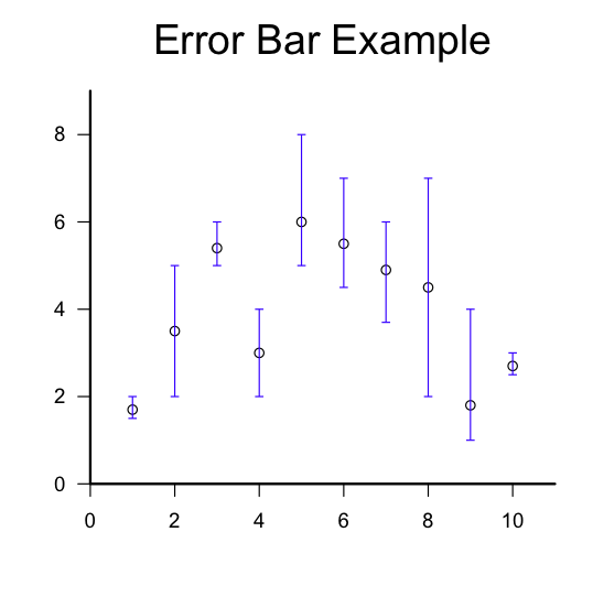
Figure 1. Example error bars.

Figure 1. Example error bars.

By Allan Roberts

This is a follow up to a previous post, Error Bars with R. The main difference is that the function used here allows the upper and lower limits of each error bar to be specified individually (rather than using a single parameter for the radius of an interval). Also, the “segments” function is used instead of the “arrows” function. The “segments” function is a lot like the “lines” function, except the endpoints of the line segments are given differently for the two functions. I’ve found that the segments function can be more useful if you wish to vectorize the drawing of multiple segments. (In the example below, the function “segments” is passed vectors of values; in general this is faster than using a for loop for the same purpose.)

Copying and pasting the script below should reproduce the example figure shown above. (Note: depending on whether you’re using a Mac or a PC, either the “quartz” or “windows” function should work to open a new graphics window, as indicated in the comments to the script.)

R Script

add.error.bars <- function(X,upper,lower,width,col=par( )$fg,lwd=1){
segments(X,lower,X,upper,col=col,lwd=lwd,lend=1);
segments(X-width/2,lower,X+width/2,lower,col=col,lwd=lwd,lend=1);
segments(X-width/2,upper,X+width/2,upper,col=col,lwd=lwd,lend=1);
}

X = 1:10; #A sequence of the integers from 1 to 10, inclusive.
Y =   c(1.7, 3.5, 5.4,3,6,5.5,4.9,4.5,1.8,2.7); #Example values for y.
upper=c( 2, 5, 6, 4, 8, 7, 6, 7, 4, 3); #Upper limits for the error bars.
lower=c(1.5, 2, 5, 2, 5, 4.5, 3.7, 2, 1, 2.5); #Lower limits.

quartz(character(1),5,5); #Open a new graphics window on a Mac.
windows(character(1),5,5); # On a PC
plot.new();
par(usr=c(0,11, 0,max(upper)+1)); #Set the limits for the plotting window axes.
axis(1); #Draw the horizontal axis.
axis(2,las=1); #Draw the vertical axis.
box(bty=letters[12], lwd=2); #Draw a frame around the plot.
title(main=quote(Example),cex.main=2,font.main=1); #Add a title.
points(X,Y); #Plot the data points.

add.error.bars(X,lower,upper,width=0.2,col=rgb(0,0,1)); #Draw the error bars.

R Bootcamp 2013 at BMSC

A beautiful Sunday in Bamfield (photo credit: Gillian Walker).

A beautiful Sunday in Bamfield (photo credit: Gillian Walker).

By Christina Suzanne

This year’s R bootcamp ran from March 3-7, 2013, immediately following the
Pacific Ecology and Evolution Conference (PEEC 2013). The workshop was
taught by Dr. Jean Richardson and Dr. Brad Anholt. The participants
ranged from R novice to R veterans; however, everyone learned something
useful and new! The five intensive days covered such things as data
input/output, managing data, scatterplots, error bars, maps,
multi-panel figures, t-tests, ANOVA, multivariate analysis, mixed effect
models, and much, much more! It also introduced various R packages, including ggplot2, vegan and lme4. Everyone left the workshop feeling much more
confident in R, and willing to tackle their own statistical problems using
R. Attending a future R bootcamp at BMSC is highly recommended to anyone who wants to start learning the R language, or increase their understanding of it!

Inside the black box, part 1: the one sample t-test

Figure 1. A figure produced using grid library view ports.

Figure 1. A figure produced using grid library view ports.

In a typical introductory statistics course, you’re given some assumptions, and provided with formulas for churning out p-values and confidence intervals. But statistics might be left feeling rather like a black box: we’re turning input into output, but it might seem difficult  to keep track of how all those assumptions and formulas work (or don’t).

One of the simplest stats tests that you’ll see in a first statistics course is the one sample t-test for testing the null hypothesis that the population mean for a random variable with a normal distribution is equal to zero. To implement this test in R all you need is the t.test( ) function. But what are the inner workings? The R script given below generates a pseudorandom sample and then puts it through the standard R function for a t.test, as well as a user defined version that should give you just about the same p-value. But wait… inside the t-test “box” other mysteries are to be found. For example: Where did the t-distribution come from in the first place? How should you interpret that p-value? And what’s up with that null hypothesis anyways? Sometimes asking questions leads to more questions… .

You can run the script provided below by cutting and pasting it onto the R command line, and pressing <enter>.

R Script

data = rnorm(20,0,1);

T.TEST = function(data){
#a one sample t test against the null hypothesis that the population mean is zero.

n = length(data);
df = n-1;
t = sqrt(n)*mean(data)/sd(data);
p.value = 2 * (pt(-abs(t),df));
output=list(t,p.value);
names(output) = c(quote(t),quote(p.value));
return(output);
}

t.test(data);
T.TEST(data);

References

R Core Team (2012). R: A language and environment for statistical computing. R
Foundation for Statistical Computing, Vienna, Austria. http://www.R-project.org/


Kendall Tau Rank Correlation Coefficient

By Allan Roberts

Statistical correlation may or may not be an easy concept to grasp. A typical stats textbook might show you clouds of data points, attach numbers to them, and suggest that you should try to get the general idea; it’s either that or work through the algebra. You can also resort to wordy explanations such as this: If X and Y are positively correlated, X will tend to increase when Y increases, and vice versa. Note that this last statement sounds a lot like a definition based on probabilities. Wouldn’t it be nice if a statistical correlation coefficient had a simple probabilistic interpretation? Such a coefficient exists. It’s called the Kendall Tau Rank Correlation Coefficient.

Figure 1. Lines with a positive slope are indicated in red; lines with a negative slope are indicated in blue.

Figure 1. Lines with a positive slope are indicated in red; lines with a negative slope are indicated in blue. The Kendall Tau Rank Correlation Coefficient can be computed from the number of upward sloping versus downward sloping lines, as indicated by the equation in the figure. A figure like this one can be produced using the R Script given below (the long version).

Dividing the number of line segments with positive slope in Figure 1 by the total number of line segments would yield a number between 0 and 1; this proportion can be interpreted as the probability that a randomly selected line segment will have positive slope. Re-scaling this proportion, with the equation given in Figure 1, yields a number between -1 and 1 that is the correlation coefficient tau.

Reference

Kendall Tau Rank Correlation Coefficient. Wikipedia:
wikipedia.org/wiki/Kendall_tau_rank_correlation_coefficient

R Script (Short Version)

#We want to write method = “kendall” with straight quotation marks, which the
#settings for this webpage seem to not allow. Thus the convoluted code that follows.
#In R, names(kendall) will be interpreted as “kendall” with straight quotes.

kendall = numeric(0); kendall = as.data.frame(kendall); #To avoid quotation marks.
X <- sample(20,20); Y <- sample(20,20); cor(X, Y, method = names(kendall) );

R Script (Long Version)

#written by Allan Roberts, Feb 2013.
KendallExample <- function(n=20){
X <- sample(n,n);
Y <- sample(n,n);
plot(X,Y, las=1,xlim=c(0,n+4),ylim=c(0,n+4));

A <- matrix(0,n,n);
for (i in 1:n) for (j in (1:n)[-i]) if ( ((Y[j]-Y[i])/(X[j]-X[i]))>0) A[i,j] <-    1;
for (i in 1:n) for (j in (1:n)[-i]) if ( ((Y[j]-Y[i])/(X[j]-X[i]))<0) A[i,j] <-   -1;

for (i in 1:n) for (j in (1:n)[-i]){
if (A[i,j]== 1){col= 2;   lty=1};
if (A[i,j]==-1){col= 4; lty=3};
if (A[i,j] != 0) lines(c(X[i],X[j]),c(Y[i],Y[j]),col=col,lty=lty);
}

up <- (sum(A>0)/2);
down <- (sum(A<0)/2);
tau <- 2*(up-down)/(n*n-n);

text(n-4,n+4,  paste(expression(Upward), up ));
text(n-4,n+3,paste(expression(Downward), down ));
text(n-4,n+1, expression( frac( 2*(up-down), n^2-n )) );
text(n-2,n+1, adj=c(0,0.5), paste(rawToChar(as.raw(61)),round(tau,digits=3)) );
}

KendallExample(n=10);